My body of work includes projects for The Vilcek Foundation, GE, The Ecuadorian President's Office, Samsung, and Kimberly Clark. I have had the pleasure of working for Pentagram, VSA Partners, Gravitytank, Designkitchen and Sol Sender.
Expertise
Information design, user interface, brand identity, typography, web design, experience design, concept development, editorial design, prototyping.
Education
Master of Fine Arts in Graphic Design
Maryland Institute College of Art
2011-2013
Bachelor of Fine Arts in Visual Communication
The School of the Art Institute
of Chicago
2010
Professional Experience
Information Design Contractor
Pentagram :: Abbott Miller
07.11– Present
Various information design projects ranging from data visualization, storytelling, and way-finding systems for various cultural clients.
Interaction Design Intern
VSA Partners
06.12– 08.12
Various interaction design & web development projects for various corporate and cultural clients. Prototype, ideation and business pitches for prospective clients.
Communication Design Fellow
Gravitytank
06.10– 06.11
User centered design ranging from user research, identity, prototyping, information, user interaction and interface design.
Graphic Designer & Assistant
Sol Sender
05.09– 01.11
Research, concept development, research and deployment of brand systems for diverse clients.
Web Designer
Designkitchen
02.10– 05.10
Brand identity, digital and web development for various clients in their digital capabilities.
Teaching Experience
Typography II
Maryland Institute College of Art
2013
Assigned a user interface project, assisted various software and material demonstrations in a variety of media and supported with other three projects. The class focused on building a complex set of skill-sets to get students ready to deploy typographic systems across different mediums.
Graphic Design I
Maryland Institute College of Art
2012
Students build their knowledge of Graphic Design by being introduced to principles of layout, hierarchy, composition and Gestalt.
Teaching intern for Brockett Horne.
Advanced Design Studio
Maryland Institute College of Art
2012
Senior-level course where students build their knowledge of design discourse and professional practice in the discipline through the ideation and execution of their individual senior project. Teaching intern for Jennifer Cole-Phillips.
Information Design
Chicago Portfolio School
2011
Students are exposed to principles of information design, research and basic formal mechanisms for the display of information. Students are challenged to display complex sets of information in a journalistic-manner in order to tell complex stories.
MICA's 2013 Thesis Exhibition Identity,
a dynamic alphabet as identity.
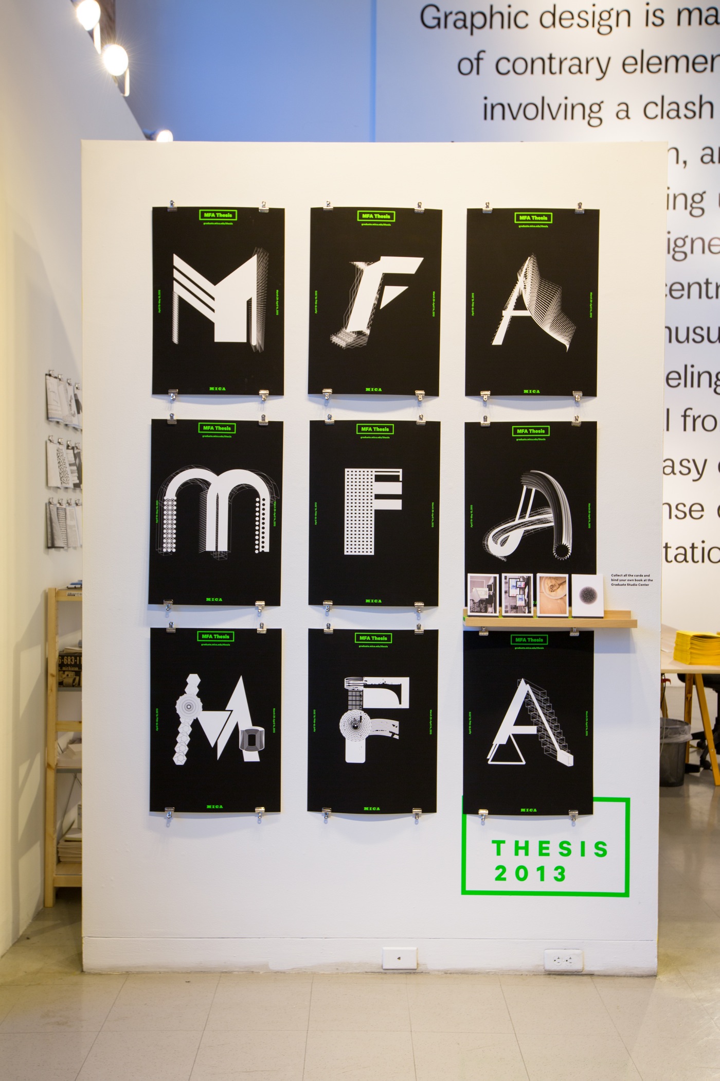
The identity is developed around the letters MFA, which have 6 possible iterations each making up for a set of 18 unique letterforms that can be assembled together to create the logotype. The letters use different processes for creation in order to bring the interdisciplinary nature of the graduate community at MICA.
While the system allows for multiple lockups of the logotype to happen, the visual language uses limited color and typeface palettes. The printed piece consists of a series of postcards that can be assembled into a publication when put together.
The website is seen as a live repository of more images and videos that showcase the complex variety of work across different mediums.
All materials were developed in collaboration with Brian Pelsoh and Kelcey Towell
Visit the site
year completed
2013
team members
x3
skills
brand identity
exhibition design
interaction design
print

The printed component serves as a memento for each artist and, when all postcards are collected, as a book documenting each individual's exhibition visit experienece.
Visit the site
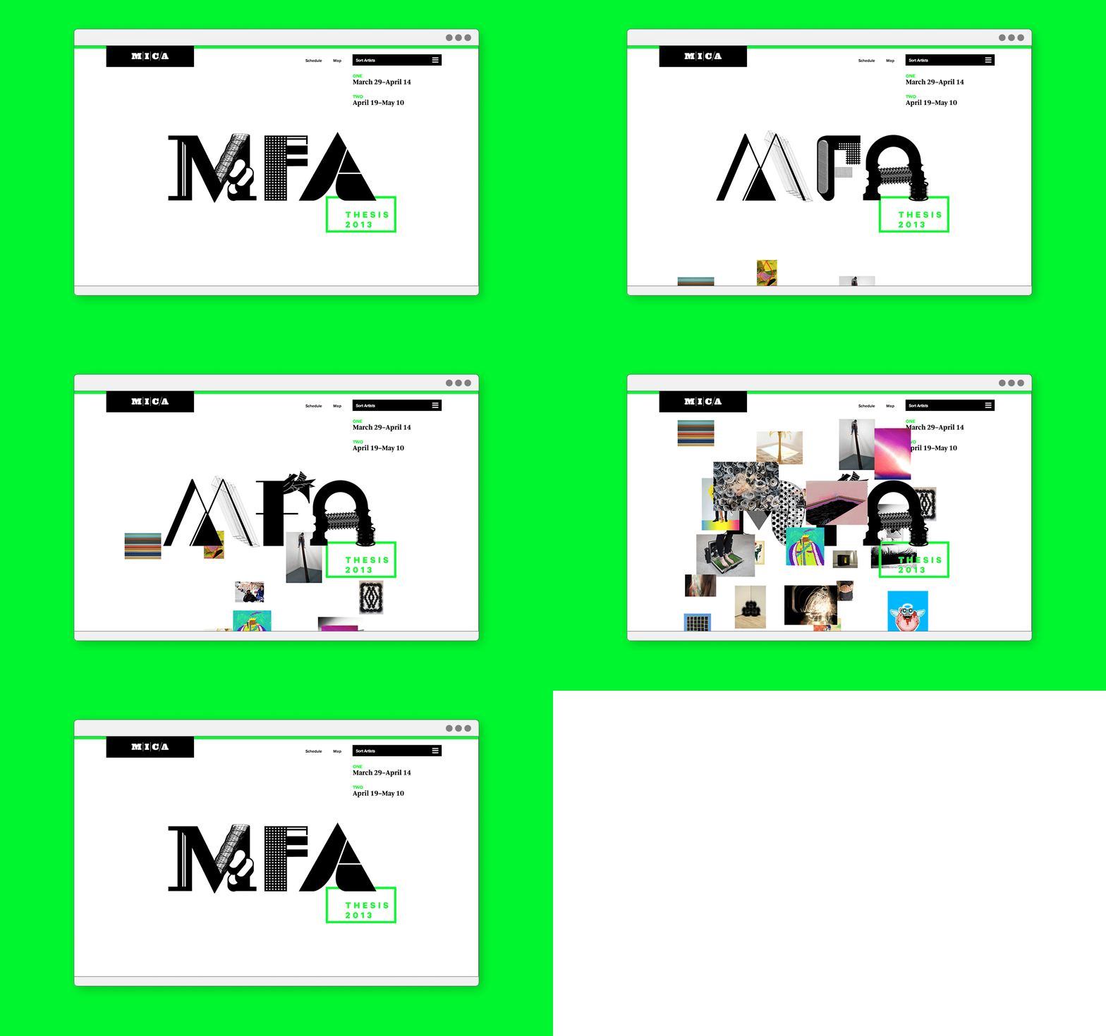
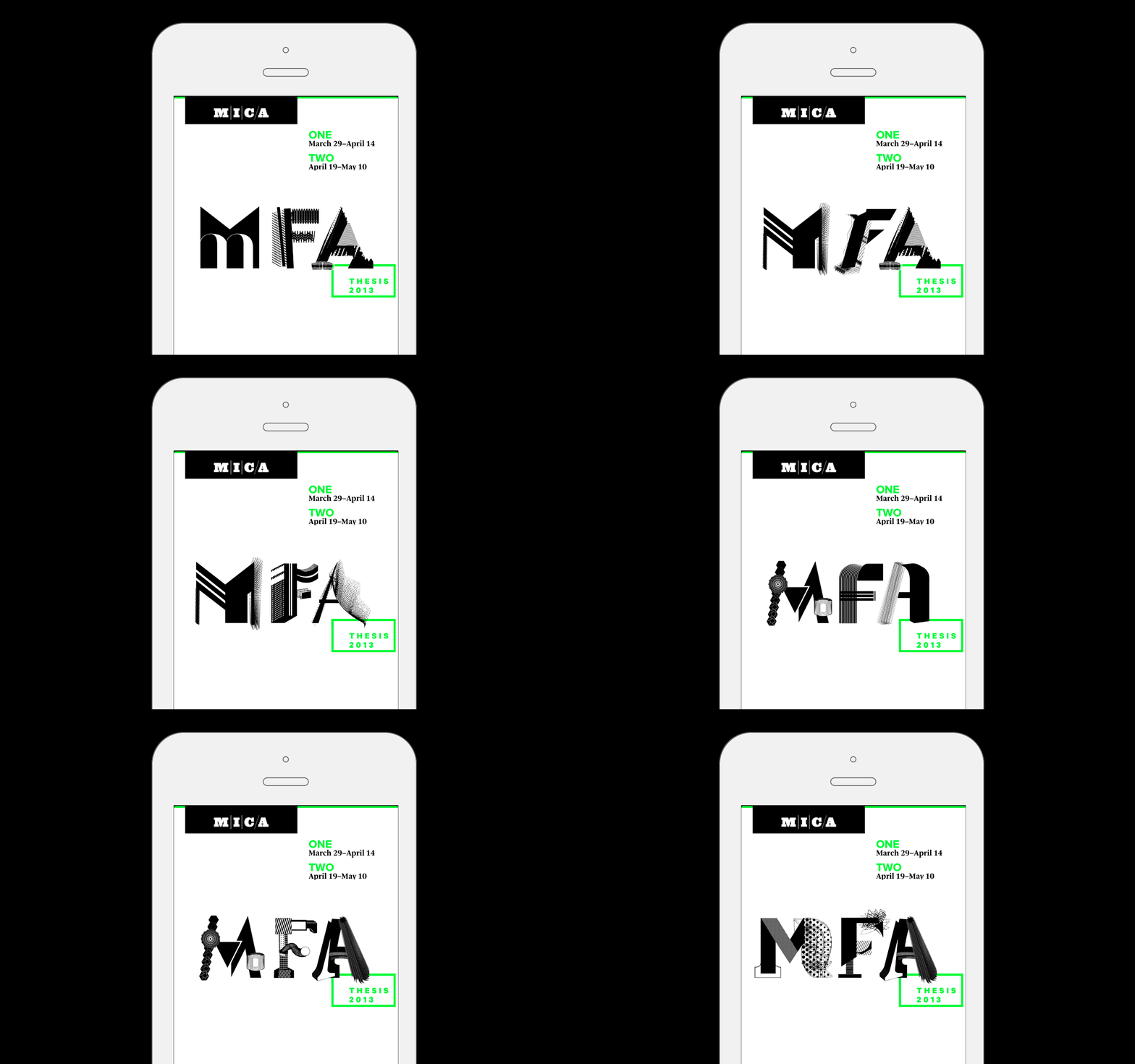

A responsive site
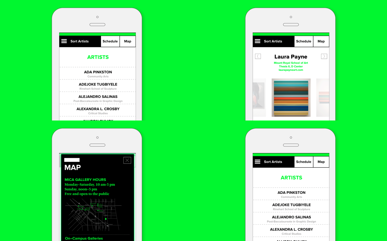
The website doubles up as a repository for the work that students have developed for their exhibitions, and as a mobile tour guide that shows visitors a map, schedule and gallery allocations for each artist.
